How Ruby and Web Components Can Work Together

As a follow up to my recent podcast all about componentized view architecture, I thought it would be worthwhile to share some real-world code examples from various projects I’ve worked on so you can get a sense of what I’m talking about.
As you’ll soon discover, many of the Ruby view components I write tend to wrap around web components—either ones I’ve written or from third-party libraries. A web component is technically a custom HTML element, paired with some combination of JavaScript and optionally CSS which affects the styling and behavior of the element. For example, instead of writing HTML for a “badge” like this (example from Bootstrap):
<span class="badge bg-warning text-dark">Warning</span>
You could write it like this (example from Shoelace):
<sl-badge variant="warning">Warning</sl-badge>
The DX of web components tends to be much higher than CSS frameworks & utility-class-based libraries because the web component can provide an explicit API at both the HTML markup level and within JavaScript. For example, if you wanted to change the above badge’s variant from “warning” to “danger”, it’s as simple as:
document.querySelector("sl-badge").variant = "danger"
Now let’s look at some real-world examples. On the Ruby side, some components use Bridgetown’s native component class, others use ViewComponent within a Rails app. For templates I generally use Serbea, but I’ll also provide some ERB translations. On the frontend side, you’ll see much use of Ruby2JS paired with Lit & Crystallized.
Documentation Note Component #
We’ll start out with something simple. At the time of this writing I’m designing a new website for Bridgetown, and I need to add notes here and there on various documentation pages. I decided to use Shoelace’s sl-alert element since that gets me pretty close to how I want the notes to look visually:
The Ruby component code is nice and concise. It accepts a type keyword argument which defaults to :primary, and an optional icon identifier. Otherwise the icon will be determined based on the note type.
# src/_components/note.rb
class Note < Bridgetown::Component
  def initialize(type: :primary, icon: nil)
    @type, @icon = type.to_sym, icon
  end

  def icon
    return @icon if @icon

    case @type
    when :primary
      "system/information"
    when :warning
      "system/alert"
    end
  end
end
And here is the template file (Serbea and ERB examples provided):
<!-- src/_components/note.serb -->
<sl-alert type="{{ @type }}" open>
  <sl-icon
    slot="icon"
    library="remixicon"
    name="{{ icon }}"
    style="font-size:1.25em"
  ></sl-icon>
  {{ content | markdownify }}
</sl-alert>
<!-- src/_components/note.erb -->
<sl-alert type="<%= @type %>" open>
  <sl-icon
    slot="icon"
    library="remixicon"
    name="<%= icon %>"
    style="font-size:1.25em"
  ></sl-icon>
  <%= markdownify content %>
</sl-alert>
As you can see, this sets up the sl-alert markup as well as sl-icon for displaying an icon in the note. The content variable is automatically provided by the component class which is the output of the block passed to the note, and we use Bridgetown’s markdownify helper to render Markdown content to HTML. Using the note component on a page couldn’t be easier:
<!-- Serbea -->
{%@ Note do %}
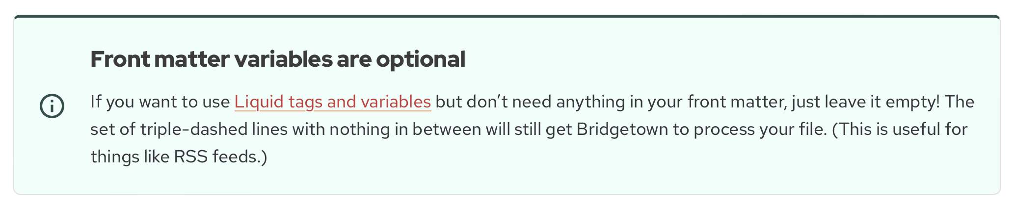
#### Front matter variables are optional
If you want to use [Liquid tags and variables](/docs/variables/)
…etc.
{% end %}
<!-- ERB -->
<%= render Note.new do %>
  #### Front matter variables are optional
  If you want to use [Liquid tags and variables](/docs/variables/)
  …etc.
<% end %>
And passing keyword arguments is just how you might expect:
<!-- Serbea -->
{%@ Note type: :danger, icon: "development/bug-fill" do %}
  …
{% end %}
<!-- ERB -->
<%= render Note.new(type: :danger, icon: "development/bug-fill") do %>
  …
<% end %>
Star Rating Component #
I’m working on a Rails app where a “ratable” object needs to display a component where people can rate it from 1 to 5 stars. Since Shoelace offers a very nice stars component, we can wrap that in our own component with both Ruby and frontend aspects. The component actually serves two purposes: it can display a read-only average of all the ratings for the object, or it can display the current user’s own rating of the object (if any).
First, here’s how the component gets used within a Rails template (all examples in Serbea):
{%@ RatingStarsComponent ratable: @bank, value: @bank.ratings.find_by(user: current_user)&.rating %}
Next, let’s look at the Ruby component:
# app/components/rating_stars_component.rb

class RatingStarsComponent < ApplicationComponent
  attr_reader :readonly

  def initialize(ratable:, readonly: false, value: nil)
    @ratable, @readonly, @value = ratable, readonly, value
  end

  def value
    return @value if @value

    @ratable.has_been_rated? ? @ratable.average_rating : nil
  end

  def ratable_url
    "/banks/#{@ratable.short_id}/ratings"
  end
end
The value method returns the value which many have been passed to the component, otherwise it returns the average rating (if possible). Also, since currently the system only has one type of ratable object, the ratable_url is hardcoded, but that could easily be made more flexible later on.
Now let’s look at the template:
<!-- app/components/rating_stars_component.html.serb -->
<rating-stars href="{{ ratable_url }}">
  <sl-rating
    {%= "readonly" if readonly %}
    {%= %(value="#{value}") if value %}
  ></sl-rating>
</rating-stars>
Pretty straightforward—but what’s the deal with that rating-stars tag? That is the custom element which has also been written alongside the Ruby component/template. Let’s take a look at that now.
# app/components/rating_stars_element.js.rb

import [ signed_in, initiate_sign_up ], from: "../javascript/lib/utils.js.rb"

class RatingStarsElement < LitElement
  custom_element "rating-stars"

  def connected_callback()
    set_timeout 100 do
      self.add_event_listener "sl-change" do |event|
        value = event.target.value
        rate(value)
      end
    end
  end

  async def rate(value)
    unless signed_in?()
      # grab the context and id out of the url for rating
      context, context_id = @href[1..].split("/")
      return initiate_sign_up(context.delete_suffix("s"), context_id)
    end

    response = await Daniel.post(@href, rating: value)
    return Toaster.raise("check2-circle", "Thanks for your rating!") if response.ok?

    alert "I'm sorry, there was a problem saving your rating. Please contact our support team."
    data = await response.text()
    console.error response, data
  end

  def render = "<slot></slot>"
end
There’s a lot going on here so I’ll break it down for you. Also, in case you’re still scratching your head wondering how a web component has been written using Ruby (that is, something very much like it), you can thank Ruby2JS. We can even use the latest Ruby 3 syntax! Awesome, isn’t it?
So here’s the rundown:
- The top line is an import statement, which should seem familiar if you’ve worked with ES modules. We actually could have added this to Ruby2JS’ autoimports config and thus omitted this line (as we have for other imported modules like
DanielandToaster). - The
RatingStarsElementis a subclass ofLitElementfrom the Lit library. Though in this example we’re not making any particular use of Lit-specific functionality (other than the implicithrefproperty), it’s right there if and when it’s needed. - When the element is connected to the DOM, we wait a beat for Shoelace’s star rating component to initialize, then we add an event handler so we can run code when the user has clicked on the stars.
- Inside the
ratemethod, marked asasyncso we can use anawaitinside the method, we try to find out if there’s even a user currently signed in. If not, it hands things off to the user sign-up process. Otherwise, itPOSTs to the supplied ratable URL with the new rating value, and displays a “toast notification” so the user knows their rating was accepted. If there was an error condition, we handle that too (and this area is certainly ripe for improvement). - Finally, the
rendermethod is used by Lit to determine the internal template to use within the web component, and since we don’t need to augment the Ruby template with anything, we just return a basicslot.
(FYI: if you’re wondering what Daniel is, it’s a simple wrapper around fetch I wrote, and it’s called Daniel because there’s a popular Ruby gem for making web requests called Faraday, and there’s a character in the TV show Lost named Daniel Faraday. Daniel. Faraday. Get it? 😋)
Now you may be wondering why I would even use a web component in this context, when it seems like Stimulus could do the job quite nicely. And many people working on a Rails app would probably assume you should use Stimulus for this sort of thing.
If that’s the flavor of ice cream you prefer, go for it! You can still employ patterns very similar to the one above. However, I personally have chosen to migrate away from Stimulus and only write web components. The reason for this is that I want to limit architectural complexity. After writing a wide variety of Stimulus controllers in the past, there were a number of cases where Stimulus just wasn’t cutting it, and I was able to write better and less buggy code by switching to Lit/web components technology. And at that point, if I’m writing both Stimulus controllers and Lit components in the same project, the question becomes: why? Why can’t I just use Lit alone?
So that’s the direction I’ve headed in. I find the conceptual 1:1 mapping between a Ruby component and a web component to be very easy to reason about. Plus, thanks to Crystallized—a small Lit add-on I wrote which provides a solid Stimulus-like actions/targets mechanism for “light DOM” markup—I really don’t miss Stimulus in the least. Let’s take a look at that next.
Soundclip Play Button #
Here’s a component which provides a play/pause button for an audio clip. It also connects up with a site-wide, persistent audio player not covered herein. (I’ve simplified the example down a little from the shipping component for clarity.)
The Ruby component itself does very little:
# app/components/soundclip_component.rb

class SoundclipComponent < ApplicationComponent
  def initialize(soundclip:, hidden: false, order: nil)
    @soundclip, @hidden, @order = soundclip, hidden, order
  end
end
And here’s the Ruby template, making great use of multi-line Serbea filters:
<soundclip-button
  {%= %(style="display:none") if @hidden %}
  {%= %(order="#{@order}") if @order %}
>
  {{
    content |>
    strip |>
    safe |>
    link_to:
      rails_blob_path(@soundclip.audio_file),
      class: "button is-primary",
      "soundclip-button-action": "play"
  }}
</soundclip-button>
This button wraps around an icon/title pair passed to it within other templates. An example being:
{%@ SoundclipComponent soundclip: soundclip do %}
  <i class="icon icon-music-play-button" soundclip-button-target="icon"></i>
  <ui-label soundclip-button-target="title">{{ soundclip.name }}</ui-label>
{% end %}
So how does soundclip-button work and what’s with all those soundclip-button-action and soundclip-button-target attributes? Let’s find out!
class SoundclipElement < LitElement
  self.properties = {
    playing: { type: Boolean, reflect: true },
    # additional properties are auto-defined by Ruby2JS
  }

  self.targets = {
    button: ".button",
    title_text: "@title",
    icon: "@",
  }

  custom_element "soundclip-button"

  def initialize
    DeclarativeActionsController.new self
    TargetsController.new self

    @playing = false
    @order = 0
  end

  # no shadow dom
  def create_render_root() = self

  def play(event = nil)
    event&.prevent_default()
    player = document.query_selector("audio-player")
    if @playing
      player.stop() # player will then call the stop method
    else
      resume()
      player.play self
    end
  end

  # Plays the next soundclip within the current box
  def play_next()
    return unless @order.present?

    self
      .closest(".box")
      .query_selector("soundclip-button[order='#{@order + 1}']")
      &.play()
  end

  def stop()
    @playing = false
    self.icon.class_list.replace "icon-music-pause-button", "icon-music-play-button"
  end

  def resume()
    @playing = true
    self.icon.class_list.replace "icon-music-play-button", "icon-music-pause-button"
  end
end
I won’t go through every single line of code in detail here, but I want to highlight a few of the special aspects:
- Ruby2JS does some clever parsing of
LitElementsubclasses and tries to turn any instance variables you use into element properties. Pretty cool stuff, but we also declareplayingexplicitly because we want the current play state of the component to be reflected back out to theplayingattribute of the element in the DOM. self.targets— this uses Crystallized’s targets config to set up methods which can be called to query various elements. Soicon: "@"means that you can callself.iconand get the child DOM element marked withsoundclip-button-target="icon", alsobutton: ".button"meansself.buttonwill get any child element with abuttonclass.- The lines
DeclarativeActionsController.new selfandTargetsController.new selfinstantiate the Lit controllers provided by Crystallized. The actions controller handles markup like you saw in the Ruby component template—e.g., asoundclip-button-action="play"attribute means when the link is clicked, theplaymethod of the web component will get called automatically.
Collapsing Mental Models #
As DHH is often fond of saying, conceptual compression is a hallmark of Rails, and it’s a philosophy I very much subscribe to as well. I also like to collapse mental models. The fewer layers of “different stuff” living in parallel universes you have to boot up in your mind in order to accomplish simple tasks, the better.
What I love so much about the patterns above is that once you’ve wrapped your mind around what’s a Ruby component and what’s a web component, the two can operate as one conceptually-speaking across a wide variety of use cases…and by using Ruby2JS, you don’t even need to leave your beloved Ruby syntax behind. I find it fatiguing to have to context-switch constantly between Ruby and JavaScript when working on a singular feature. Now I don’t have to. Amazing! While knowledge of DOM APIs and some JavaScript methods is still required, the mental models are mostly collapsed. In a broad sense, you’re just writing Ruby objects and templates to build up discrete building blocks of user interface, and merely a small amount of effort is required to determine which is the code that executes server-side vs. client-side.
Boom. 🤯